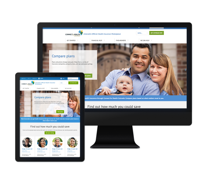
A Fresh Foundation: Crafting a Modern, User-Friendly Website for a Growing Digital Ministry
When Standing in the Word Ministries set out to expand their website, they initially planned to add new features to their existing platform. However, given the age of their site—already exceeding the typical 2-3 year lifecycle—it became clear that a full rebuild would be the most efficient and cost-effective solution. Rather than piecemealing updates, we worked with them to create a website that was built to last, offering better functionality and a modernized user experience.
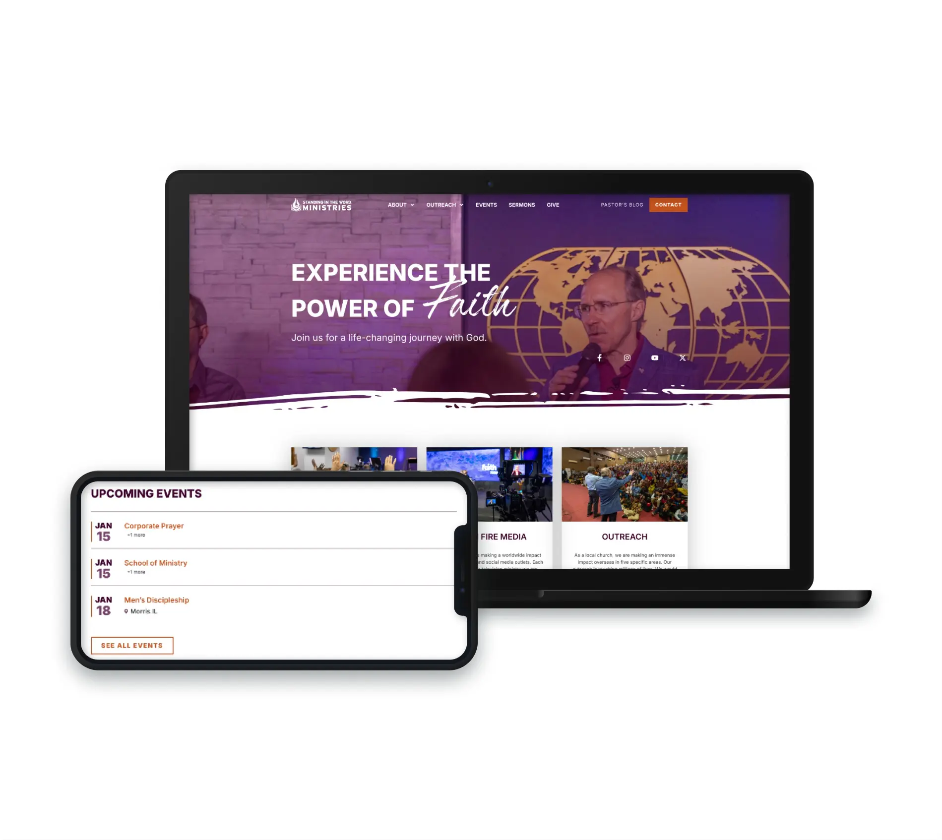
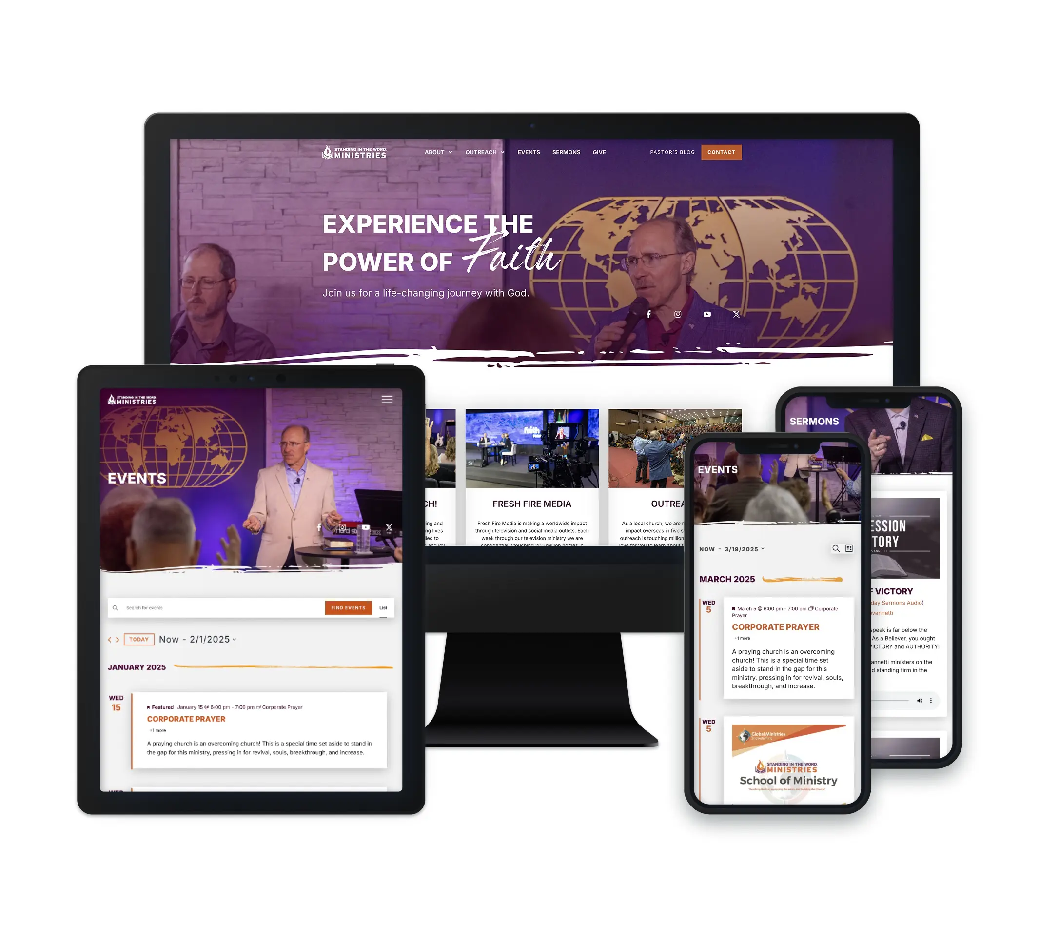
Our team collaborated with Standing in the Word to create a website that not only reflects their mission but also provides a seamless experience for both users and administrators. The website serves to connect their global community, spanning from the midwestern US to East Africa and South Asia, so it needs to be fast and easy to access from anywhere. Additionally, their international charitable work relies heavily on contributions from donors, so a clear navigation structure is a must. The new site is structured for growth, designed to encourage user engagement, and built to support their evolving digital needs.
A Custom-Built Solution for Dynamic Content & Connection
To ensure the ministry can effectively share its message and updates, we developed multiple custom post types tailored to their diverse content needs, including sermons, blogs, events, and team information. This structured and scalable system allows them to easily share updates from their outreach efforts abroad, providing transparency to donors and encouraging engagement from their global community. Each content type now has a dedicated, user-friendly layout that enhances accessibility and readability, making it easier than ever for visitors to stay informed and connected with their mission.
Balancing Content with Visual Appeal
One of the biggest challenges was ensuring that the extensive information on the site was digestible without overwhelming visitors. To combat content overload, we focused on strategic formatting by utilizing visuals, buttons, and clear section headers to break up text-heavy pages. This approach not only improved readability but also made for a more visually engaging experience that keeps users engaged.
Outcomes
We’re grateful for the opportunity to have created a site that serves the Standing in the Word community. Their dedication to sharing meaningful content is now supported by a modern, user-friendly website that will grow alongside their ministry.
We use cookies to optimize our website and our services.
Functional
Always active
The technical storage or access is strictly necessary for the legitimate purpose of enabling the use of a specific service explicitly requested by the subscriber or user, or for the sole purpose of carrying out the transmission of a communication over an electronic communications network.
Preferences
The technical storage or access is necessary for the legitimate purpose of storing preferences that are not requested by the subscriber or user.
Statistics
The technical storage or access that is used exclusively for statistical purposes.The technical storage or access that is used exclusively for anonymous statistical purposes. Without a subpoena, voluntary compliance on the part of your Internet Service Provider, or additional records from a third party, information stored or retrieved for this purpose alone cannot usually be used to identify you.
Marketing
The technical storage or access is required to create user profiles to send advertising, or to track the user on a website or across several websites for similar marketing purposes.