A Full Logo Rebrand for Local Chiropractic Clinic
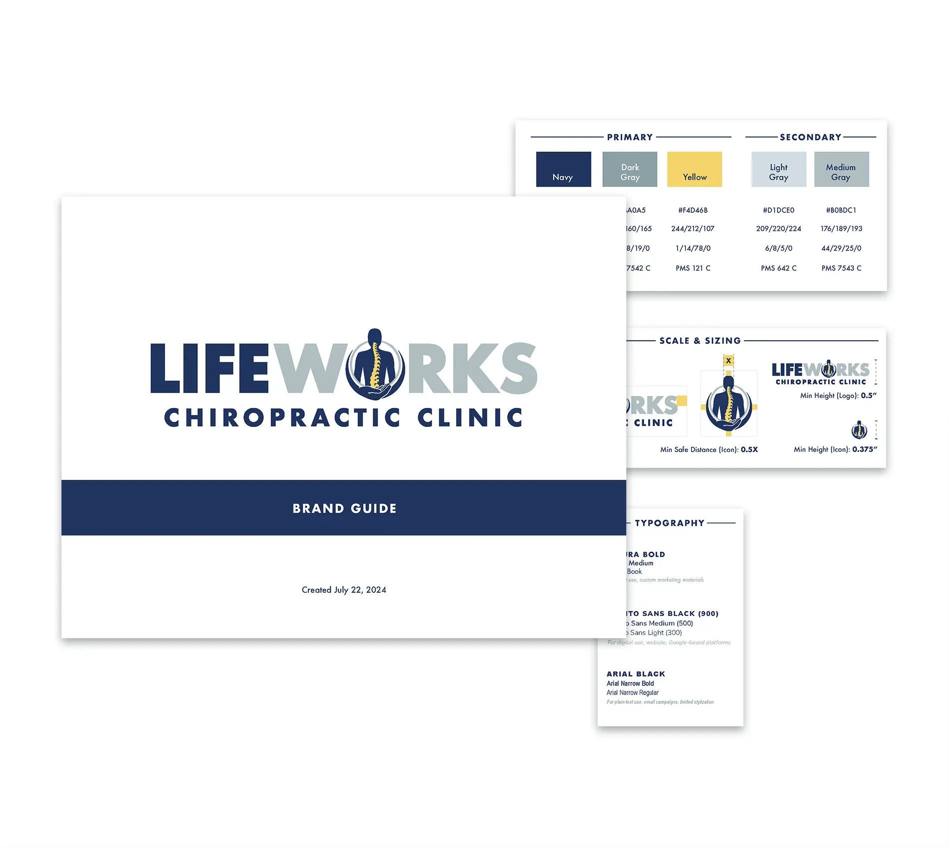
Lifeworks Chiropractic came to us looking for a new logo that better reflected their current team and values—as an organization grounded in purpose, driven by wellness, and deeply connected to their community. Through thoughtful exploration of their mission, vision, and values, we delivered a refreshed identity that aligns with their big-picture goals and carries meaning into every part of their brand.

Project Details
Company
Lifeworks Chiropractic Clinic
URL
N/A
Launched
July 2024
Industry
Services
Overview
Based in Northern Colorado, Lifeworks Chiropractic is led by Dr. Thole, whose vision is to serve as a pillar of health and healing for people of all ages. Their previous logo no longer aligned with their broad client base and modern aesthetic, so we guided the team through a full brand identity redesign process. Starting with concepting & exploration, then into design & refinement, and ending with a logo & mark that now appears across their website, signage, and marketing materials.
Branding That Starts with Vision
Before diving into design, we spent time getting grounded in the heart of Lifeworks’ mission. Understanding their culture and client experience was central to how we approached the redesign. We considered their target audience, competitors, and long-term goals, ensuring that the final logo would serve as a true extension of their brand.
Designing with Intention
Color theory and visual harmony were key throughout the design process. We aimed to communicate health, balance, and support. The result is a logo that feels modern, trustworthy, and aligned (ha, pun intended).
Refreshed Digital and Physical Branding
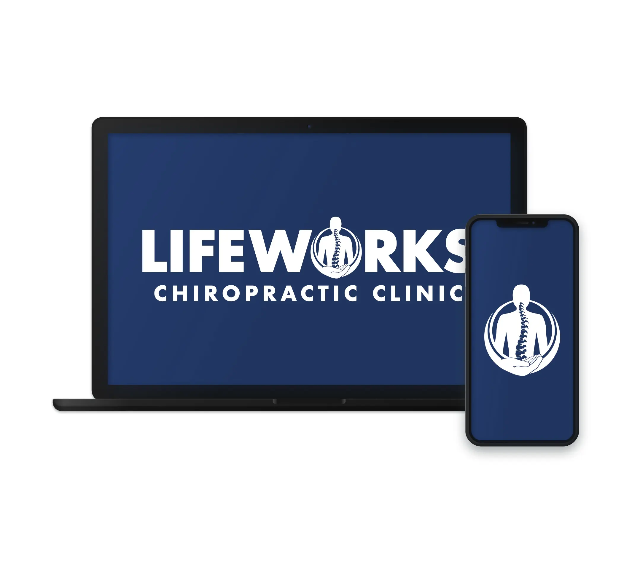
The new Lifeworks logo has become a foundational piece of their identity. It now appears consistently across their digital and physical touchpoints—from their website and social profiles to their office signage and business cards—creating a cohesive and professional impression at every stage of the patient journey.
Outcomes
The Lifeworks Chiropractic logo redesign was more than a visual update—it was a reflection of growth, clarity, and commitment to service. With a new identity that matches their mission and energy, Dr. Thole and his team are now better positioned to expand their impact and continue guiding their community toward health and healing.
