Creating A Custom Website To Uphold Project Equity’s Mission
Project Equity is a nonprofit organization dedicated to helping business owners transition to employee ownership, creating stronger companies and more resilient local economies. Their website needed to speak to multiple audiences, from business owners and employees to fundraisers and community partners. Jollity stepped in to design and develop a site that clearly communicates their mission, simplifies their messaging, and integrates seamlessly with their internal tools.
Project Details
Overview
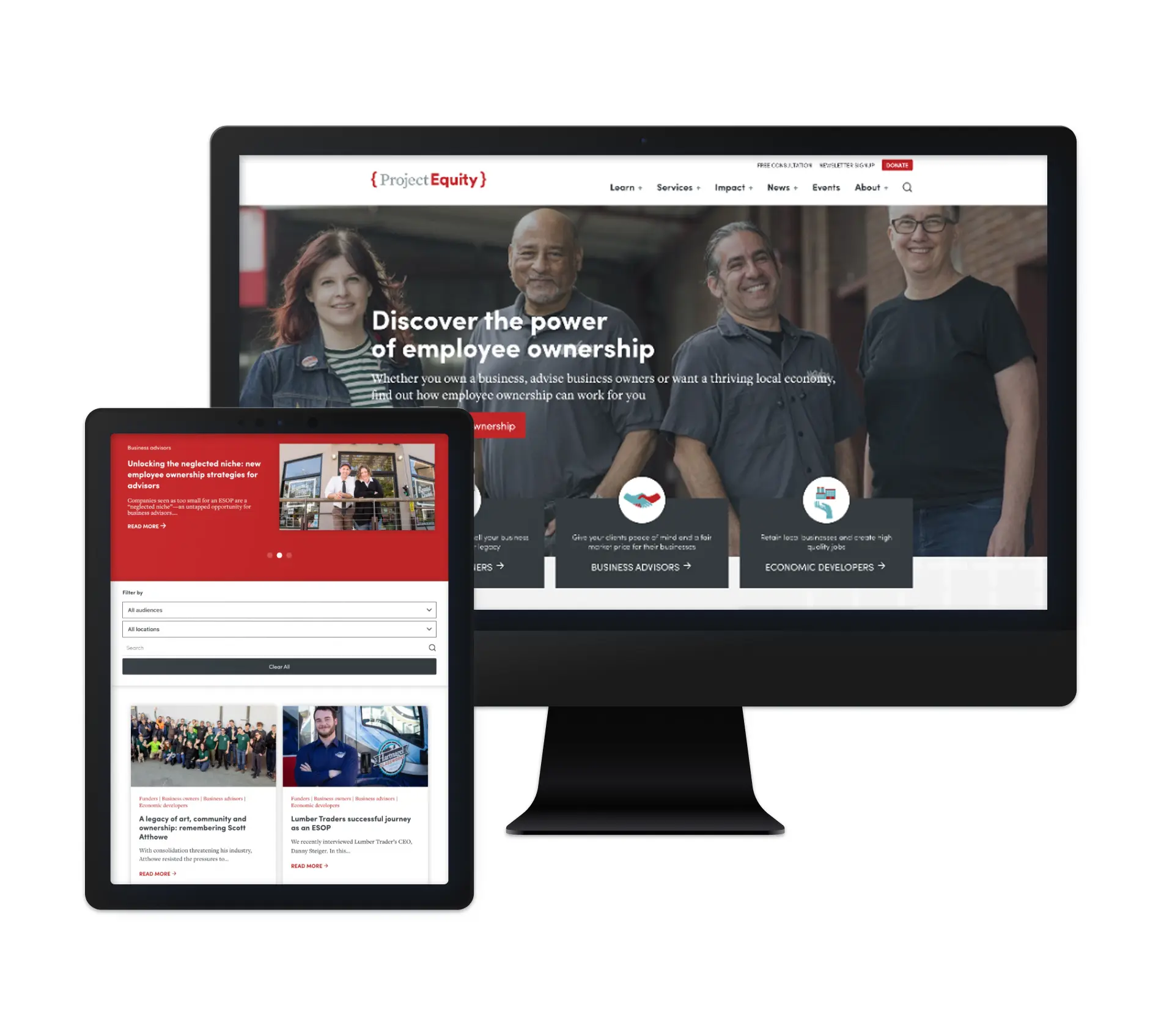
This project started with an in-depth discovery phase, where we collaborated with five different departments within Project Equity. Each team had unique needs, and the website had to serve as a versatile tool for sales, client services, fundraising, and more. We transformed their cluttered web presence into a concise, engaging, and easy-to-navigate platform that drives action and fosters a deeper understanding of employee ownership.
From Cluttered to Concise
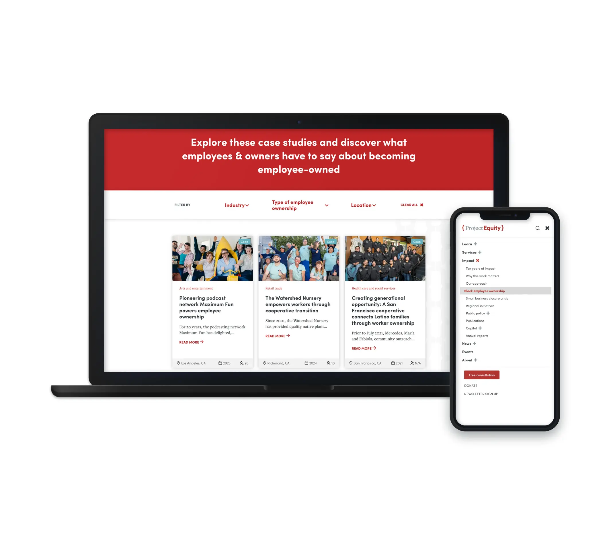
Project Equity’s mission is powerful, but their old website made it difficult for users to quickly grasp what they do. Our redesign prioritized clarity and accessibility, ensuring that visitors could easily follow their journey—from learning about employee ownership to accessing Project Equity’s resources. The new site effectively showcases their services, success stories, and team members in a way that is both informative and compelling.
A Visual Storytelling Experience
To make the transition to employee ownership feel approachable, we crafted a visually guided journey on the ‘Services’ pages. As users scroll, they are led step by step through the process—from the initial consultation to post-transition support. This interactive approach removes guesswork and helps potential clients feel confident in their next steps.
Seamless Integrations for Maximum Efficiency
Beyond aesthetics, the site needed to work within Project Equity’s existing processes. We integrated scheduling software, CRM tools, and a data platform to ensure that inquiries, client interactions, and internal workflows were effortlessly connected. The result? A website that doesn’t just look good—it actively supports their operations.
Outcomes
With a fully custom design, a streamlined user experience, and smart integrations, Project Equity now has a website that clearly communicates its mission and drives engagement. We’re proud to have helped them build a digital platform that empowers business owners to embrace employee ownership and create lasting economic impact. Check it out at project-equity.org!
