Navigating the Redesign of Key Website Pages
Cheers to the recent launch of revamped pages on rallydaypartners.com! Jollity took on the challenge of modernizing key sections of the website with a sleek design, engaging functionality, and captivating visuals—all while ensuring that the updates seamlessly blended with the existing site’s aesthetic.
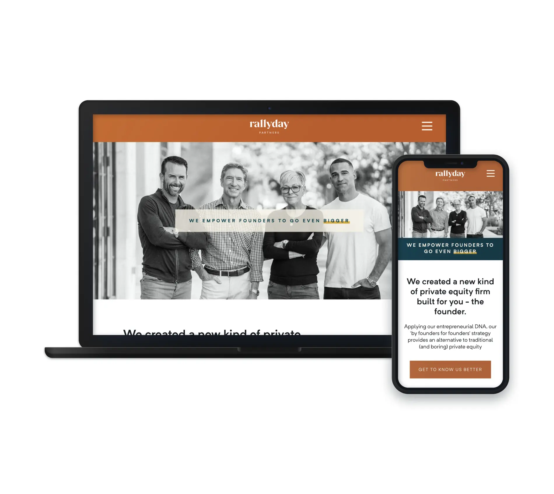
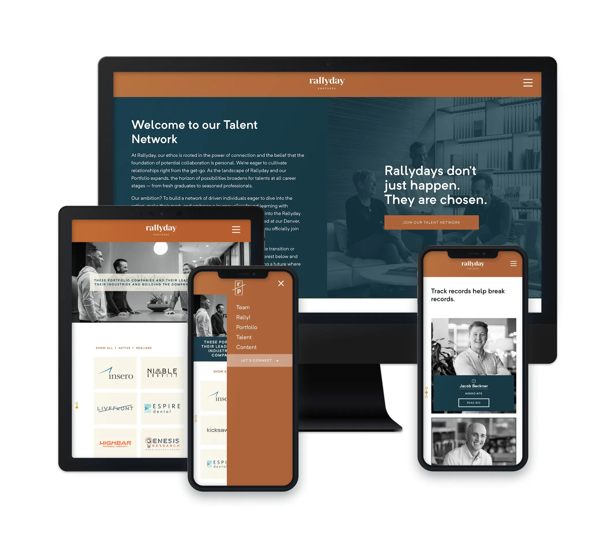
Project Details
Overview
Rallyday Partners needed a content and design refresh that wouldn’t disrupt the integrity of their well-established brand. The challenge? Enhancing select pages while maintaining a consistent look and feel across the entire site. Through strategic design tweaks and subtle yet impactful animations, we gave three of their most important pages a fresh, modern feel without requiring a full site overhaul.
Planning With a Tight Timeline
With the holiday season fast approaching, this project required careful planning and efficient execution. Jollity worked closely with Rallyday Partners to ensure that every element of the redesign aligned with their vision—without missing any critical deadlines. Our collaborative approach and meticulous time management allowed us to deliver results on schedule while maintaining top-tier quality.
A Targeted Refresh With Big Impact
Not every website needs a full-scale rebuild to stay current. This project is a perfect example of how targeted updates can elevate a brand’s online presence without a massive redesign. By refreshing just a few high-impact pages, Rallyday Partners now has a more modern, engaging website that better reflects their expertise and professionalism.
